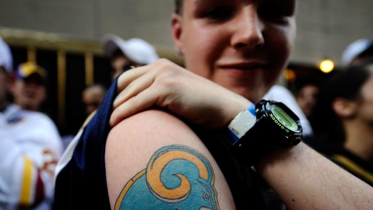
The Los Angeles Rams came through with a logo that looks exactly like that of their cross-town rivals.
Exactly two weeks to the day, that featured a new logo. At the time, it was being reported that this was a leak of what the Rams logo would look like in 2020. Fans were incredibly upset since the insignia looked way too much like that of the Los Angeles Chargers. While the logo went viral, many tried to say it was simply not true and that the Rams marketing department would see the outcry and immediately change up their efforts.
Well, every Rams fan’s fear was confirmed today as the team took to social media where they officially unveiled the logo. As you can see, the yellow part kind of looks like the Chargers thunderbolt. The Rams made sure to post another image after revealing that this is simply a shortened version of the insignia and that the yellow is meant to signify the Rams’ horns.
As you can imagine, the reactions to this new logo were even more labored than the first time around. People had some strong feelings towards the new Rams insignia and they made sure to bring the memes on Twitter.
You can check out some of the best reactions to the logo, below.


