Designing great album art isn’t just about how a package looks — it’s also about how it feels
This story is part of a series spotlighting LGBTQ creatives — from art directors to glam squads — who help bring your favorite artists’ visions to life.
Great album artwork doesn’t stop at the front cover. From teaser videos to promotional photos to digital assets for streaming services, these visuals take listeners inside the mind of an artist before they can even press play. Here, three creatives — Concord’s Carrie Smith, ALMA collaborator Anna Miettinen and Republic Records’ Julie Vastola — break down their eye-catching work on projects for St. Vincent, the Jonas Brothers and more.
CARRIE SMITH
VP creative services
Concord

After graduating from college in her hometown of Oklahoma City, Carrie Smith got a job in advertising — and hated it. So she quit to pursue her dream of working as a creative director and found a job at Vanguard Records through Craigslist. “I packed my car full of everything I owned and drove to L.A.,” Smith recalls. Nearly a decade later, she was running the department, and when Concord acquired the label in 2015, Smith came too. She’s since grown the team from three to seven staffers and now oversees “everything creative that comes out of Concord,” which has included cover art and packaging for two acclaimed projects: Rhye’s Blood, which won a Juno Award for Album Art of the Year in 2019, and St. Vincent’s MassEducation, the 2018 acoustic rework of her album Masseduction.
“Obviously, a lot of art is digital, and we’re focused on what the cover looks like on Spotify or if you can read the type, but for me, the printed pieces are where it’s at — that’s where the experience comes from,” Smith says. “It’s about going on this journey with the artist and creating a visual language and world for [their art] to live in.”
Rhye, Blood
I was working and talking with Adi Farrell, head of creative at Loma Vista [Recordings, Rhye’s label], and he set me up with Mike [Milosh], who is Rhye. He came into the office and had taken all these beautiful photos, and we sat down for at least two hours together going through the images. We just talked a lot. I think that’s such an important thing, to be a very good listener when an artist comes in — it helped develop in my mind how to visually represent that. We developed a pretty strong connection, and once we nailed the cover, the rest of the design just followed.
I did a lot of work on color correcting. It’s funny, when you have a black and white image, there are so many different ways to print it, and I don’t think people really consider that. And with the packaging, I wanted it to be this very tactile experience. When you touch it, I want it to make you feel something. There’s a matte finish on it, and then I did a spot gloss on the type. So it’s very subtle, but it shows up just slightly with this little shimmer in the light.
St. Vincent, MassEducation
I was working with Pamela Neal, who took the photos and has worked with Annie [Clark, aka St. Vincent] in the past. We had several different images and decided on this one because we felt like no one had really seen Annie before in this really intimate manner — and that’s exactly what the music is about. It’s the stripped-down, piano version of [2017’s] Masseduction, so we wanted to show that with this grainy, nude photo. It’s very blurry, but it also sets you up for the experience you’re about to have when you play the music.
What I did with the type was really fun: I wanted it to have this classical nature, with the curviness and the swirls, to emphasize the fact that it’s a piano album. And again, what we did with the printing of it was also a tactile experience. The type got a gold foil, so it feels really rich — you feel it’s bumps and curves. It’s a nice contrast to the blurred photo.
I remember on a Saturday I went into management’s office to meet with Annie and had all this stuff spread out on the table. When she looked at the specific combination, she said, “I believe in that.” And when she said that, I was just like, “Wow.” To have an artist like her say that really struck me. It felt like a connection.
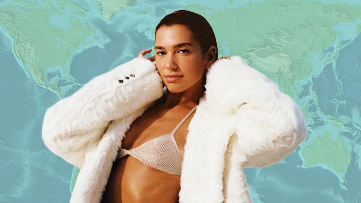
ANNA MIETTINEN
Creative director for ALMA

Anna Miettinen has been making art alongside ALMA, one of pop’s buzziest queer singer-songwriters, for almost her entire life — they’re twin sisters, after all. Growing up in Kuopio, Finland, Miettinen attended an arts-focused primary school and found herself drawn to drawing and painting at an early age. So when ALMA’s music career took off, it felt natural for Miettinen to handle her visuals, too. “Whenever there’s an art piece that [Alma’s] label wants, it’s almost like we have the same picture in our minds already,” she says. “ALMA always tells me it’s hard for her to work with other people because she feels like it’s so complicated to explain everything, and with me, it’s always very easy.”
That trust can take them to some unexpected places: “There was this one shoot where ALMA was naked in a bathtub and I was pouring milk on her,” says Miettinen, who also performs in ALMA’s live band and is combing through five years worth of photos and footage for an upcoming documentary. “We do weird shit.”
ALMA, “When I Die” / “Lonely Night” / “Summer”
With all the cover photos that I’ve done, we’ve wanted to go with a similar look. We’ve always been into the film camera look — not anything polished or clean or super American, because we’re Finns from this poor family, so we’re used to just taking shitty Polaroids and being creative with that. It’s more interesting than a beautiful portrait taken in a studio. The tape is actually done by hand — I write on a piece of tape, put it over the photo and then scan it, print it out and do it again. Usually the stuff we do is pretty random.
[For “Lonely Night,”] ALMA had one day between studio sessions in Los Angeles, and the label was asking for the cover. ALMA was just like, “Fuck, I have no idea what we should do.” We walked around in the streets, just vibing. We found that car, and then I also did a lot of editing and taping afterward. We just play around.
ALMA, “Cowboy”
That [press photo] was a fun one, actually. We were just dressing up crazy. I think those were my clothes. ALMA obviously has to play the game a bit, but I don’t. I kind of boycott the whole artist thing, because I don’t support that polished and fake [look]. I feel with the artwork I do for ALMA, I want it to be super real. I want to show people that not everything has to be super expensive clothes and stuff. I just want it to be down to earth — I think that’s the coolest thing you can do.
JULIE VASTOLA
Director of visual content
Republic Records

Vastola has been working in the music industry since high school, when she interned at SRP Music Group, the production company founded by Evan Rogers and Carl Sturken — better known as the guys who discovered Rihanna. She ultimately worked there for eight years, during which time she also shot music videos for singer-songwriter Kandace Springs that caught the attention of Prince, who invited Vastola out to Paisley Park for a meeting she calls a “turning point for my confidence.” Within a year, she started at Republic as a digital marketing manager; she was promoted to her current role last year.
Today, she commissions and creative-directs all types of assets, from lyric videos (like those for Conan Gray’s Kid Krow album) to Spotify imagery (like the graphics that accompanied Julia Michaels’ Inner Monologue Part 1 and 2) to album art (like Hailee Steinfeld’s Half Written Story EP). “I often find artists have an unconventional and complex way of thinking, in the best way,” says Vastola, who won a Silver Clio Award last year for her work with the Jonas Brothers. “I am able to meet their vision with an eye-catching piece of content translated for a digital world. To be able to do it at the highest level just doesn’t seem real.”
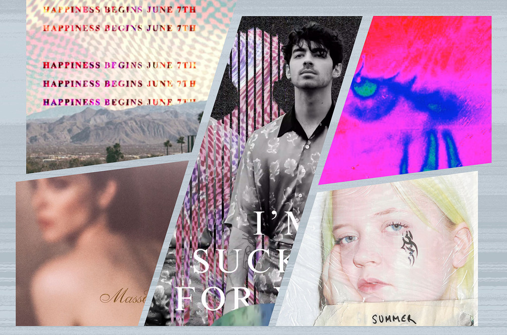
Jonas Brothers, Happiness Begins
When given the incredible opportunity to work on the highly anticipated return of the Jonas Brothers, I knew we had to create a campaign that had never been done before. I am particularly proud of our Happiness Begins tracklist reveal — this was the first time an artist [did that with] Spotify Canvas [in-app visuals that replace a song’s album cover]. Each song on the album had its own piece of collage-inspired content that either had the title of the song hidden or used images and footage that suggested the title, and fans scrambled to figure out the names of the songs.
A proud moment for me was when the fans recognized our repurposed use of the patterns on each brother’s shirt from the cover art. The fans also gave credit to the fact that we paid special attention to creating different social assets for each brother that all were connected. Myself and Katia Temkin, whom I commissioned to create the content for Happiness Begins, couldn’t keep our eyes away from Twitter after the Spotify tracklist reveal was released. It’s always a proud moment when you see a fan tweet an exact thought you had while in the process of creating.
Lil Wayne, Tha Carter 5 and Funeral
My work on Tha Carter 5 and Funeral has been some of the most creatively fruitful and innovative work I’ve accomplished so far. In the album playback meeting for Tha Carter 5 with Wayne’s management, our team at Republic learned that the cover art would be a photo of Wayne and his mother. I was immediately inspired to bring their poignant relationship to the forefront of the creative, and subsequently, this idea became the backbone of the rollout. We were able to get a recording of Wayne’s mother expressing her love and pride for her son, which we incorporated into the assets.
For Funeral, we explored 3D digital assets for the first time. Ryan Frank [animator and motion graphics artist] digitally built a complex cemetery scene that continued to flood with red smoke as the video progressed. Both projects are amazing examples of what creativity can blossom from a single seed image and its correlating music.